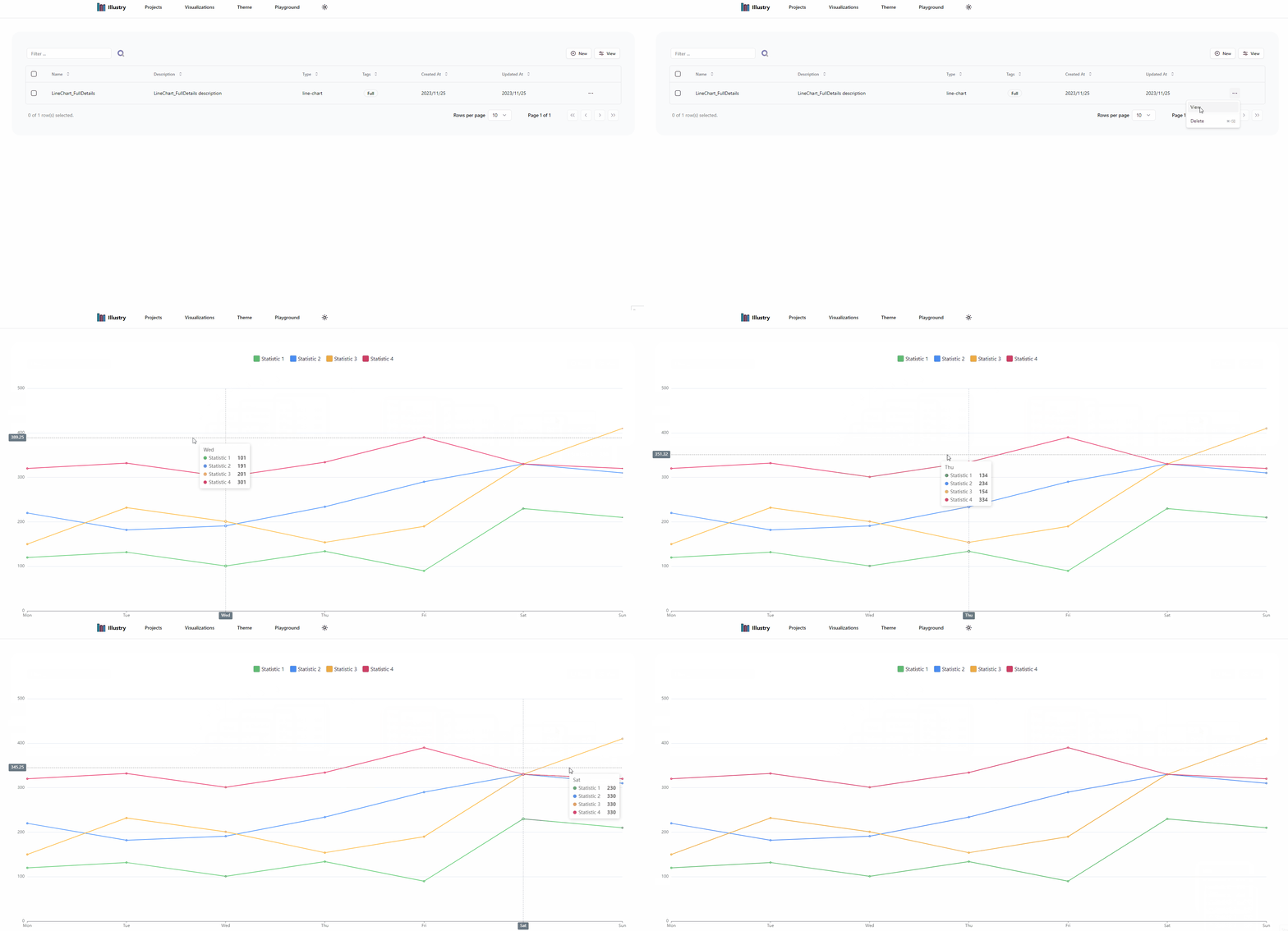
Line Chart
The Line Chart visualization is a versatile tool for representing trends and patterns in numerical data over time. It is widely used for visualizing the relationship between two continuous variables and highlighting trends or fluctuations.
Line Chart Data Structure
To represent a Line Chart, you can use the following AxisChartData interface:
type AxisChartData = { headers: string[]; values: { [key: string]: number[] };};Key Attributes
- headers: An array of strings representing the categories or dimensions along one of the axis.
- values: A dictionary where each key is a category or dimension, and the corresponding value is an array of numerical values along the other axis.
Pros and Cons
Pros
-
Multi-Dimensional Comparison: Line Charts excel at comparing multiple dimensions simultaneously, providing a comprehensive view of the data.
-
Clear Value Representation: Numerical values are clearly represented along both the X and Y axes, making it easy for users to interpret and compare.
Cons
-
Complexity with Excessive Categories: When dealing with a large number of categories or dimensions, the visualization may become crowded and challenging to interpret.
-
Limited for Categorical Data: Line Charts are most effective for numerical data and may not be the optimal choice for representing categorical data.
Line Chart Example
